Case 04 — Takeit
Takeit — The IT Experience
A cloud kitchen brand built to move fast, look fresh, and feel worth the wait.
Gallery
What it did
Results
Logo and wordmark designed from scratch — custom letterforms, no off-the-shelf fonts
Full icon library covering all cuisine and service categories
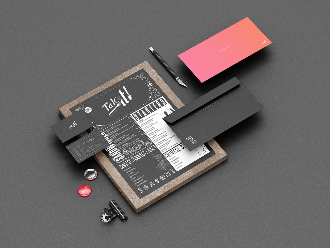
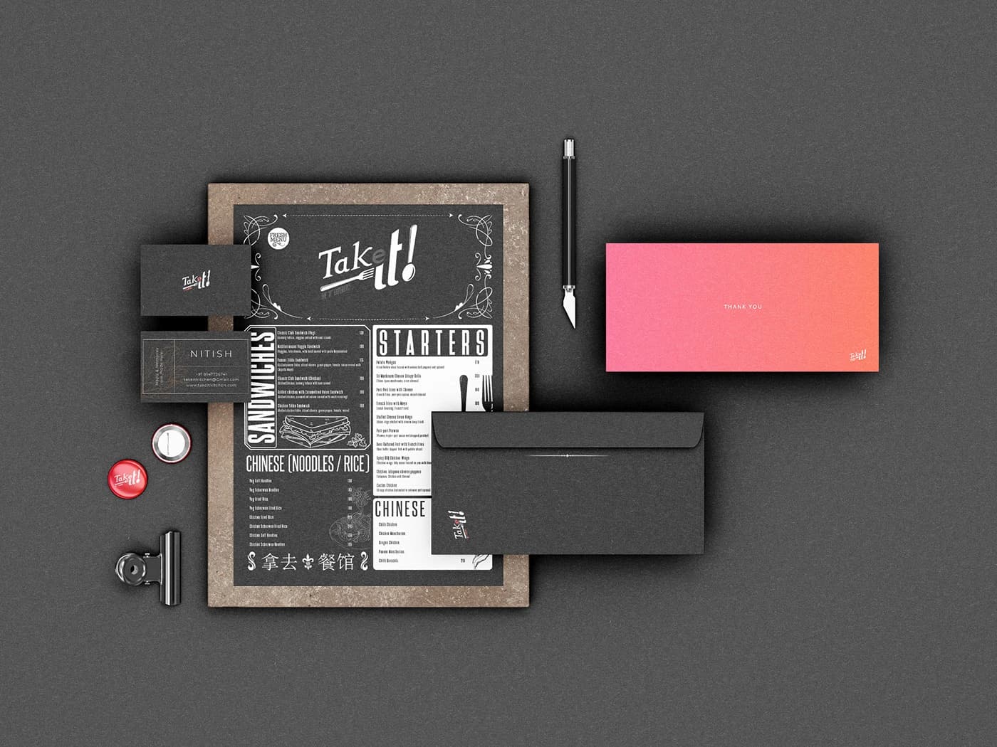
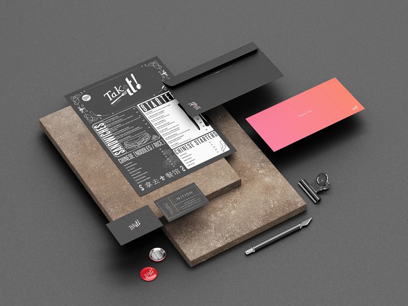
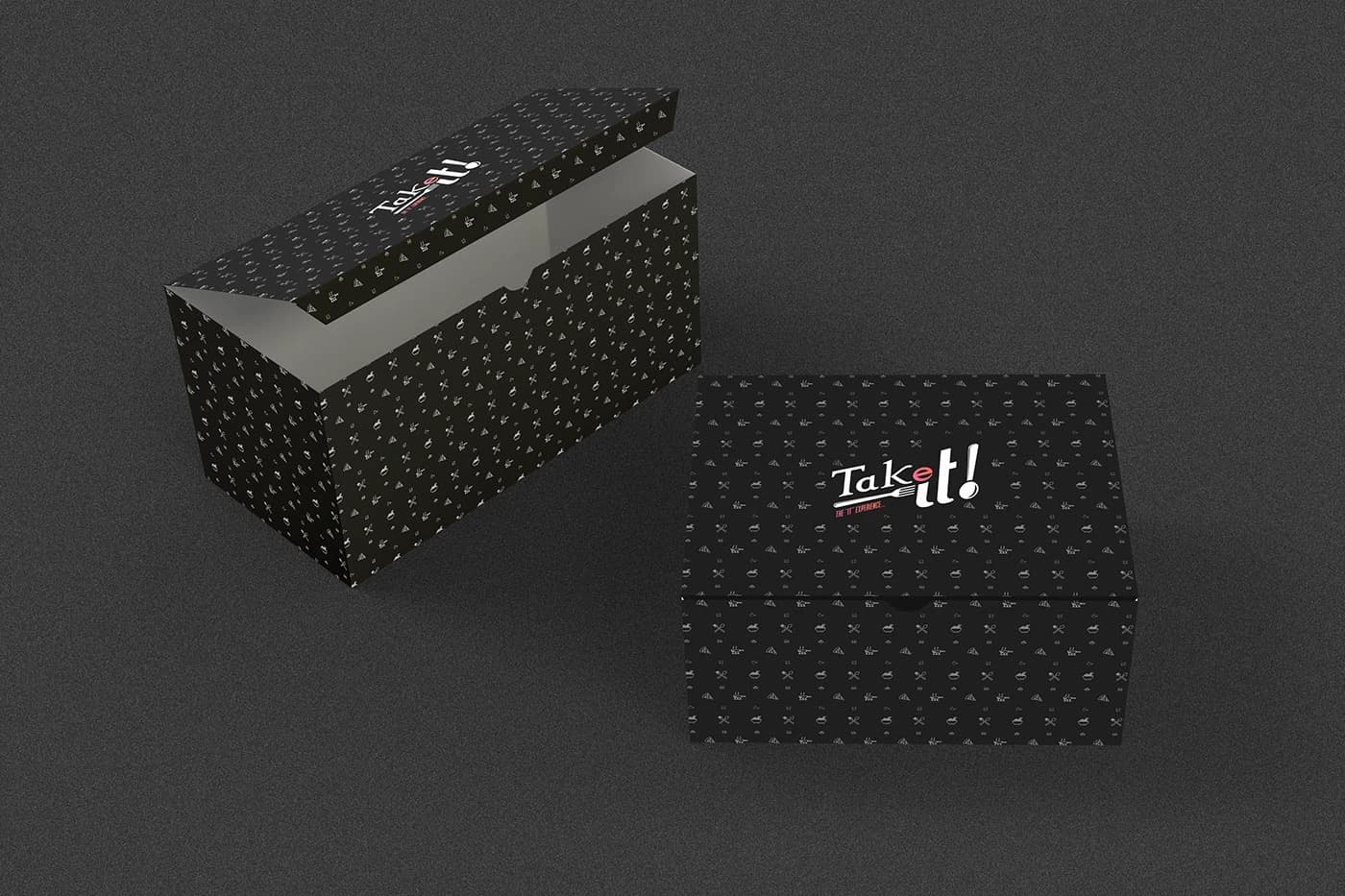
Pattern system and brand toolkit ready for packaging, menus, and app UI
Brand identity published on Behance — 337 views, 67 appreciations
The brief
Takeit needed a brand that could hold its own in the delivery-app grid without looking like every other food startup. As a vertical kitchen — cooking across multiple cuisines under one roof — the identity had to feel dynamic and distinctive, not generic.
The approach
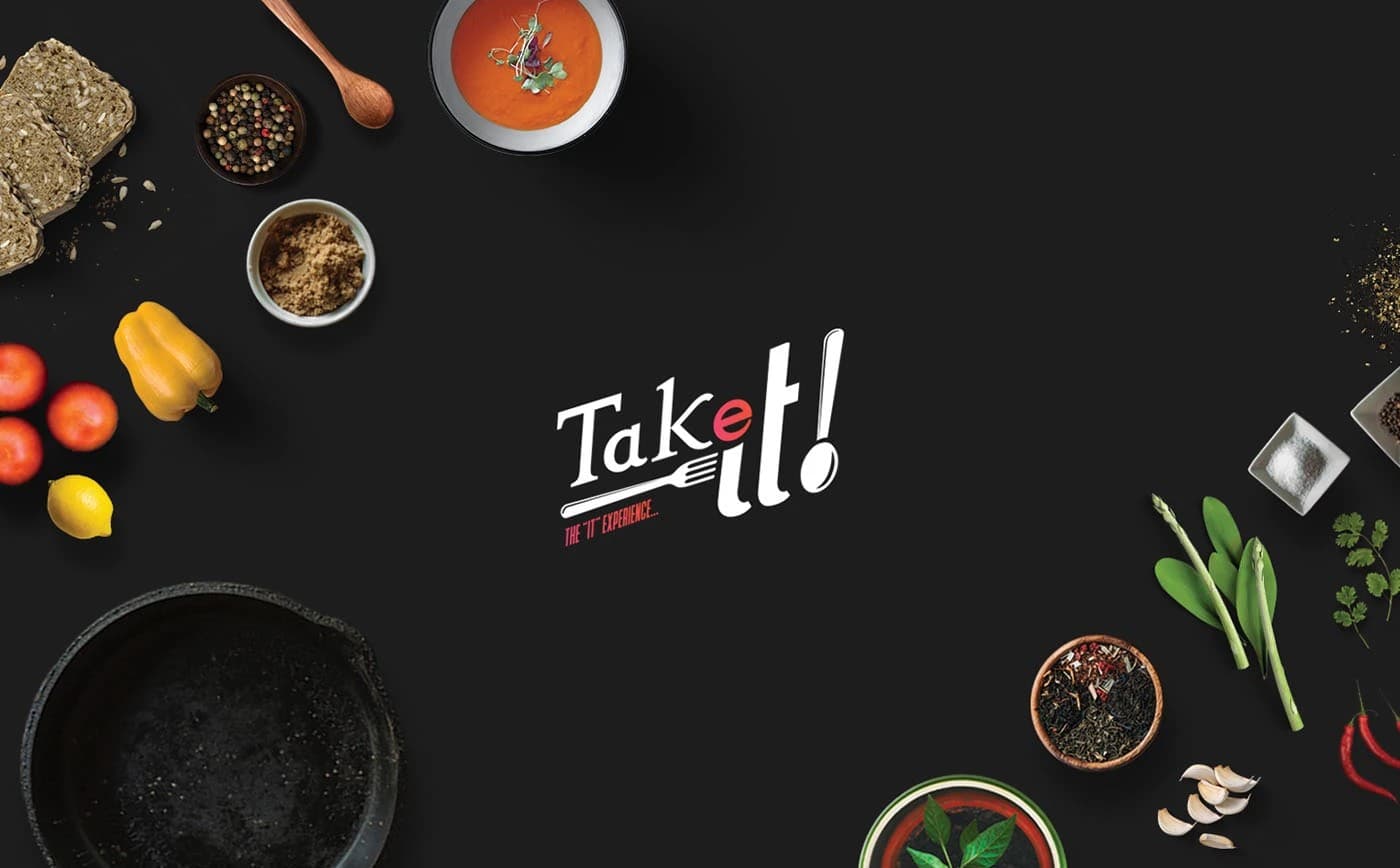
The logo was built on two ideas: verticality (the cloud kitchen model) and motion (fast delivery). The wordmark uses a custom fork-and-knife underline, with the 'e' in red as a typographic wink — making the name read as 'Take it!' The supporting icon system and pattern language extend the brand into packaging, collateral, and digital touchpoints.